Tailwind CSS 快速入门
方法论:不背类名,用到就查。AI 最擅长写 Tailwind。
📖 本节目标
学完本节,你将能够:
- ✅ 理解 Tailwind CSS 的核心思想
- ✅ 掌握最常用的 20 个类名
- ✅ 实现响应式设计
- ✅ 快速调整组件样式
预计用时:25 分钟
0. 开始前必看(重要!)
0.1 Next.js 里必须用 className!
⚠️ 超级重要!
在 Next.js/React 项目里,HTML 属性
class要写成className(驼峰命名)。错误写法:
<div class="bg-blue-500"> ❌ 会报错!正确写法:
<div className="bg-blue-500"> ✅ 这才对!为什么? 因为
class在 JavaScript 里是保留关键字,React 用className避免冲突。
本教程的所有代码示例都用 className,可以直接复制到 Next.js 项目里使用。
0.2 推荐安装 VS Code 插件
Tailwind CSS IntelliSense - 神器!
安装方法:
- 打开 VS Code
- 点击左边的扩展图标(四个方块)
- 搜索
Tailwind CSS IntelliSense - 点击安装
安装后的好处:
- 鼠标悬停类名,显示实际 CSS 值
- 自动补全类名(打
bg-会提示所有背景色) - 颜色类名旁边显示色块🎨
1. Tailwind 是什么?
一句话解释
Tailwind = 把 CSS 写成类名
比喻:Tailwind 就像 乐高积木🧱
- 传统 CSS = 自己捏泥巴(想捏啥样捏啥样,但容易塌)
- Tailwind = 给你准备好的积木块(各种形状和颜色),你只需要拼起来
传统 CSS:
.button {
  background-color: blue;
  color: white;
  padding: 10px 20px;
  border-radius: 8px;
}
Tailwind:
<button className="bg-blue-500 text-white px-5 py-2 rounded-lg">
  按钮
</button>
为什么用 Tailwind?
| 传统 CSS | Tailwind |
|---|---|
| 需要起类名 | 不用起名 |
| 写在单独文件 | 直接写在 HTML |
| 改样式要切换文件 | 改样式就在当前位置 |
| AI 生成效率低 | AI 生成效率极高 |
对 Vibe Coder 的好处:让 AI 生成 Tailwind 代码,效果又快又好。
2. 最常用的 20 个类名
2.1 布局类
| 类名 | 作用 | CSS 等价 |
|---|---|---|
flex | 弹性布局 | display: flex |
grid | 网格布局 | display: grid |
hidden | 隐藏 | display: none |
block | 块级元素 | display: block |
Flex 布局详解(重要!)
Flex = 让元素排队站好
┌─────────────────────────────┐
│  ┌──┐  ┌──┐  ┌──┐          │  ← justify-center (水平居中)
│  │1 │  │2 │  │3 │          │
│  └──┘  └──┘  └──┘          │
└─────────────────────────────┘

┌─────────────────────────────┐
│         ┌──┐                │
│         │1 │  ← items-center │  ← items-center (垂直居中)
│         └──┘                │
└─────────────────────────────┘
记忆口诀:
justify-*= 管横着(水平方向)items-*= 管竖着(垂直方向)
常用组合:
{/* 水平居中 */}
<div className="flex justify-center">内容</div>

{/* 垂直居中 */}
<div className="flex items-center">内容</div>

{/* 水平+垂直居中(完美居中) */}
<div className="flex justify-center items-center">内容</div>

{/* 两端对齐 */}
<div className="flex justify-between">
  <span>左边</span>
  <span>右边</span>
</div>
2.2 间距类
| 类名 | 作用 | 数值说明 |
|---|---|---|
p-4 | 内边距 | 4 = 16px |
px-4 | 左右内边距 | x = 水平方向 |
py-4 | 上下内边距 | y = 垂直方向 |
m-4 | 外边距 | m = margin |
mx-auto | 水平居中 | auto = 自动 |
gap-4 | 元素间距 | 用于 flex/grid |
数值规律(记住这个公式!)
公式: 数字 × 4 = 像素数
| Tailwind | 像素 | 计算 |
|---|---|---|
p-1 | 4px | 1 × 4 |
p-2 | 8px | 2 × 4 |
p-4 | 16px | 4 × 4 |
p-6 | 24px | 6 × 4 |
p-8 | 32px | 8 × 4 |
p-10 | 40px | 10 × 4 |
Vibe Coding 提示:想写
15px这种不规则数字?方法 1(推荐):告诉 AI “我想要 15px 的内边距”,AI 会用
p-[15px]这种自定义值写法。方法 2:用最接近的数字,比如 15px ≈
p-4(16px),差 1px 肉眼看不出来。
{/* 卡片内边距 */}
<div className="p-6">卡片内容</div>

{/* 按钮内边距 */}
<button className="px-4 py-2">按钮</button>

{/* 容器居中 */}
<div className="mx-auto max-w-4xl">内容</div>
2.3 颜色类
| 类名 | 作用 |
|---|---|
bg-blue-500 | 背景色 |
text-white | 文字颜色 |
border-gray-200 | 边框颜色 |
颜色深度:100(最浅)→ 900(最深)
{/* 蓝色按钮 */}
<button className="bg-blue-500 text-white">按钮</button>

{/* 灰色背景 */}
<div className="bg-gray-100">内容</div>

{/* 红色文字 */}
<span className="text-red-500">错误提示</span>
常用颜色:
| 颜色 | 用途 |
|---|---|
blue-500 | 主色调、链接 |
gray-100~900 | 背景、边框、文字 |
red-500 | 错误、警告 |
green-500 | 成功、确认 |
white/black | 基础色 |
Vibe Coding 提示:想用渐变色、复杂阴影?
直接问 AI:“帮我写一个从蓝色渐变到紫色的背景”
AI 会给你
bg-gradient-to-r from-blue-500 to-purple-500这种完整类名,你不用记!
2.4 文字类
| 类名 | 作用 |
|---|---|
text-sm | 小号字 (14px) |
text-base | 正常字 (16px) |
text-lg | 大号字 (18px) |
text-xl | 更大 (20px) |
text-2xl | 标题级 (24px) |
font-bold | 加粗 |
font-medium | 中等粗细 |
text-center | 居中对齐 |
{/* 标题 */}
<h1 className="text-2xl font-bold">大标题</h1>

{/* 正文 */}
<p className="text-base text-gray-600">正文内容</p>

{/* 小字提示 */}
<span className="text-sm text-gray-400">提示文字</span>
2.5 边框和圆角
| 类名 | 作用 |
|---|---|
border | 1px 边框 |
border-2 | 2px 边框 |
rounded | 小圆角 (4px) |
rounded-lg | 中圆角 (8px) |
rounded-xl | 大圆角 (12px) |
rounded-full | 完全圆形 |
shadow | 小阴影 |
shadow-lg | 大阴影 |
{/* 卡片 */}
<div className="border rounded-lg shadow p-4">
  卡片内容
</div>

{/* 圆形头像 */}
<img className="rounded-full w-12 h-12" src="avatar.jpg" />

{/* 输入框 */}
<input className="border border-gray-300 rounded px-3 py-2" />
2.6 宽高类
| 类名 | 作用 |
|---|---|
w-full | 宽度 100% |
w-1/2 | 宽度 50% |
w-64 | 宽度 256px |
h-screen | 高度 100vh |
min-h-screen | 最小高度 100vh |
max-w-4xl | 最大宽度(容器) |
{/* 全宽按钮 */}
<button className="w-full">按钮</button>

{/* 固定宽度 */}
<div className="w-64">侧边栏</div>

{/* 容器居中 */}
<div className="max-w-4xl mx-auto">内容</div>
3. 响应式设计
断点前缀
| 前缀 | 屏幕宽度 | 设备 |
|---|---|---|
| 无前缀 | 默认 | 手机 |
sm: | ≥640px | 大手机 |
md: | ≥768px | 平板 |
lg: | ≥1024px | 笔记本 |
xl: | ≥1280px | 桌面 |
Grid 布局详解
Grid = 切蛋糕🍰
手机(默认):              平板(md:):              桌面(lg:):
┌────────────┐          ┌──────┬──────┐         ┌────┬────┬────┐
│   卡片1     │          │ 卡片1 │ 卡片2 │         │卡1 │卡2 │卡3 │
├────────────┤          ├──────┼──────┤         ├────┼────┼────┤
│   卡片2     │          │ 卡片3 │      │         │卡4 │卡5 │卡6 │
├────────────┤          └──────┴──────┘         └────┴────┴────┘
│   卡片3     │
└────────────┘
grid-cols-1              grid-cols-2             grid-cols-3
使用方法
{/* 手机单列,平板双列,桌面三列 */}
<div className="grid grid-cols-1 md:grid-cols-2 lg:grid-cols-3 gap-4">
  <div>卡片 1</div>
  <div>卡片 2</div>
  <div>卡片 3</div>
</div>

{/* 手机隐藏,桌面显示 */}
<div className="hidden lg:block">
  只在大屏显示
</div>

{/* 手机小字,桌面大字 */}
<h1 className="text-xl md:text-2xl lg:text-4xl">
  响应式标题
</h1>
4. 状态变化
悬停效果
{/* 悬停变色 */}
<button className="bg-blue-500 hover:bg-blue-600">
  按钮
</button>

{/* 悬停下划线 */}
<a className="hover:underline">链接</a>

{/* 悬停放大 */}
<div className="hover:scale-105 transition">
  卡片
</div>
焦点效果
{/* 输入框焦点 */}
<input className="border focus:border-blue-500 focus:ring-2" />
禁用状态
<button className="bg-blue-500 disabled:bg-gray-300 disabled:cursor-not-allowed">
  按钮
</button>
5. 实战组件示例
5.1 按钮
{/* 主要按钮 */}
<button className="bg-blue-500 hover:bg-blue-600 text-white px-4 py-2 rounded-lg">
  主要按钮
</button>

{/* 次要按钮 */}
<button className="border border-blue-500 text-blue-500 hover:bg-blue-50 px-4 py-2 rounded-lg">
  次要按钮
</button>

{/* 危险按钮 */}
<button className="bg-red-500 hover:bg-red-600 text-white px-4 py-2 rounded-lg">
  删除
</button>
5.2 卡片
<div className="bg-white rounded-xl shadow-lg p-6 hover:shadow-xl transition">
  <img className="w-full h-48 object-cover rounded-lg" src="image.jpg" />
  <h3 className="text-lg font-bold mt-4">卡片标题</h3>
  <p className="text-gray-600 mt-2">卡片描述文字</p>
  <button className="mt-4 bg-blue-500 text-white px-4 py-2 rounded">
    了解更多
  </button>
</div>
5.3 输入框
<div>
  <label className="block text-sm font-medium text-gray-700 mb-1">
    邮箱地址
  </label>
  <input
    type="email"
    className="w-full border border-gray-300 rounded-lg px-3 py-2
               focus:border-blue-500 focus:ring-2 focus:ring-blue-200"
    placeholder="请输入邮箱"
  />
</div>
5.4 导航栏
<nav className="bg-white shadow">
  <div className="max-w-6xl mx-auto px-4">
    <div className="flex justify-between items-center h-16">
      <div className="text-xl font-bold">Logo</div>
      <div className="flex gap-6">
        <a href="/" className="text-gray-600 hover:text-blue-500">首页</a>
        <a href="/about" className="text-gray-600 hover:text-blue-500">关于</a>
        <a href="/contact" className="text-gray-600 hover:text-blue-500">联系</a>
      </div>
    </div>
  </div>
</nav>
6. Vibe Coding 技巧
让 AI 生成样式
好的 Prompt:
帮我用 Tailwind CSS 创建一个:
- 产品卡片组件
- 包含图片、标题、价格、购买按钮
- 白色背景,圆角阴影
- 悬停时有放大效果
- 响应式:手机一列,平板两列,桌面四列
快速调整样式
看到 AI 生成的代码,想调整?直接问:
# 间距问题
"这个卡片内边距太大了,帮我调小一点"

# 颜色问题
"按钮颜色改成绿色"

# 布局问题
"让这三个元素水平排列"

# 响应式问题
"手机上这个要隐藏"
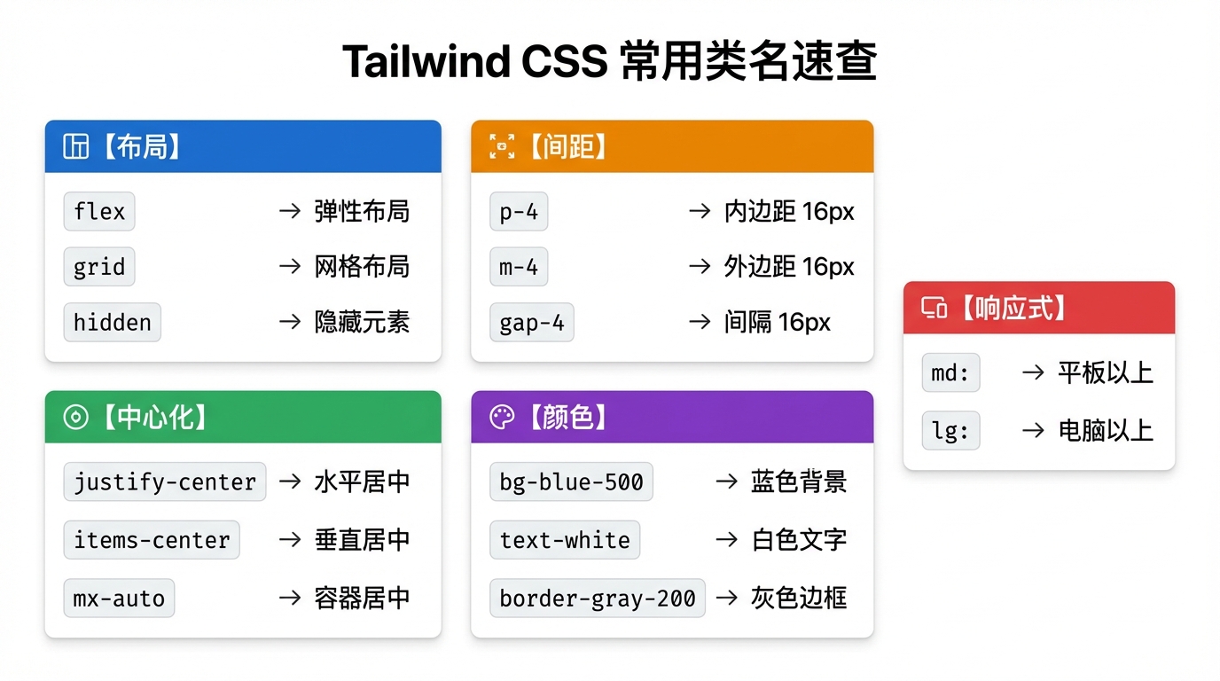
常用类名速查
复制这个到你的笔记,随用随查:
布局:flex, grid, hidden, block
居中:justify-center, items-center, mx-auto
间距:p-4, px-4, py-4, m-4, gap-4
颜色:bg-blue-500, text-white, border-gray-200
文字:text-lg, font-bold, text-center
圆角:rounded-lg, rounded-full
阴影:shadow, shadow-lg
响应式:md:, lg:, xl:
状态:hover:, focus:, disabled:
📝 小结
| 概念 | 说明 |
|---|---|
| 原子化 CSS | 每个类名做一件事 |
| 响应式前缀 | md: lg: 控制不同屏幕 |
| 状态前缀 | hover: focus: 控制交互 |
| 颜色深度 | 100-900,数字越大越深 |
| className | Next.js/React 里必须用 className,不是 class |
核心理解:
- Tailwind = 乐高积木,拼起来就行
- 数值规律:
数字 × 4 = 像素 - Flex 布局:
justify-*管横着,items-*管竖着 - 不用背,装了插件鼠标悬停就能看,或者让 AI 帮你写
- 在 Next.js 里必须用
className
📚 下一步
学习如何用 React 组件化思想构建页面。
返回 前端开发基础 查看完整目录。